Der Sandmann — A visual literary analysis
Editorial, Infographic and Illustration — “The Sandmann – a visual literary analysis” transforms the book “Der Sandmann”, written in 1806 by E.T.A. Hoffmann into a new nocturne, a new artistic presentation of moods, by working with colors, contrasts and the relation between them.
The concept behind the design is based on the political, mental and cultural radical change in 1816 and the mixing and confusion of the two systems of thought – romanticism and classicism (or enlightenment). The interaction and relation between those two systems, from imagination and reality, defines the story.
Thus, two ways of interpreting the story exist. This ambiguity is captured by a determination of different parameters, the content of the text and colorful descriptions which allow to create a set of rules. These rules are essential for working with the text in a formal way but also to recreate the text and its mood into visuals, atmospheric pictures, and a new visual nocturne.
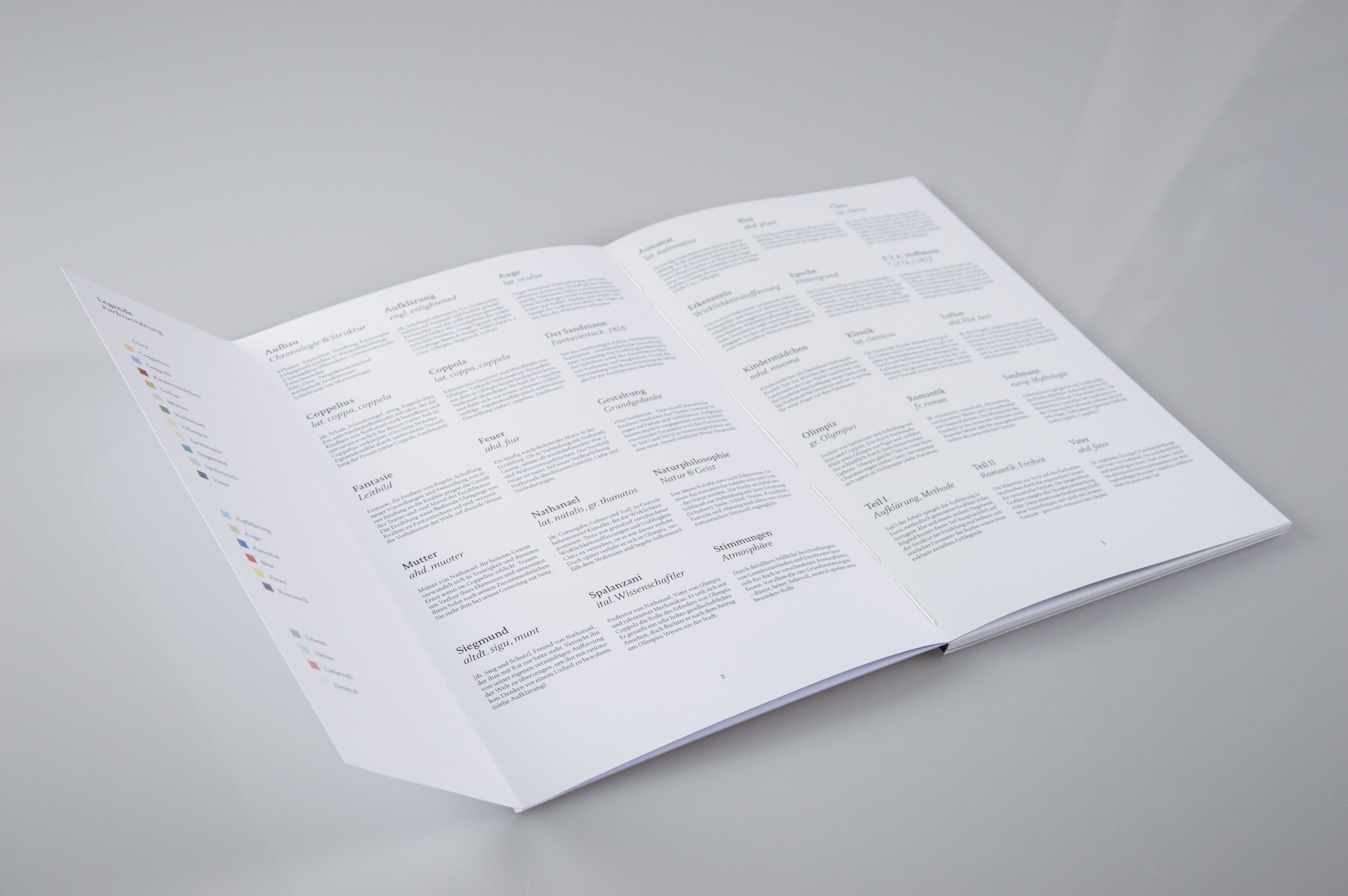
Both ways of interpreting the story were considered by working with two different methods. An analytical and scientific approach on the one hand that contains an infographic character and another approach with an artistic impression that was created by regarding the use of fantasy and a more playful dealing with form and color.
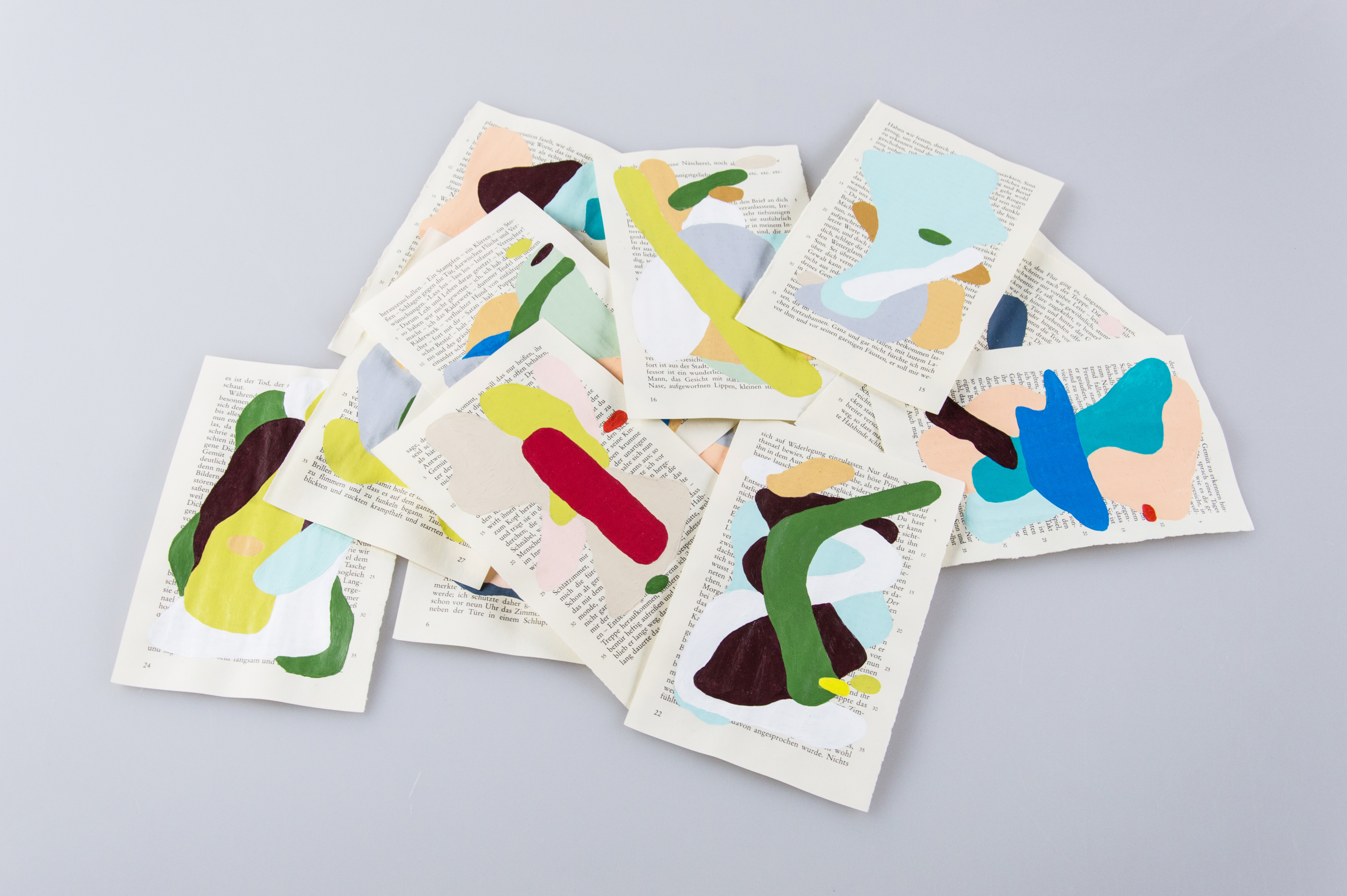


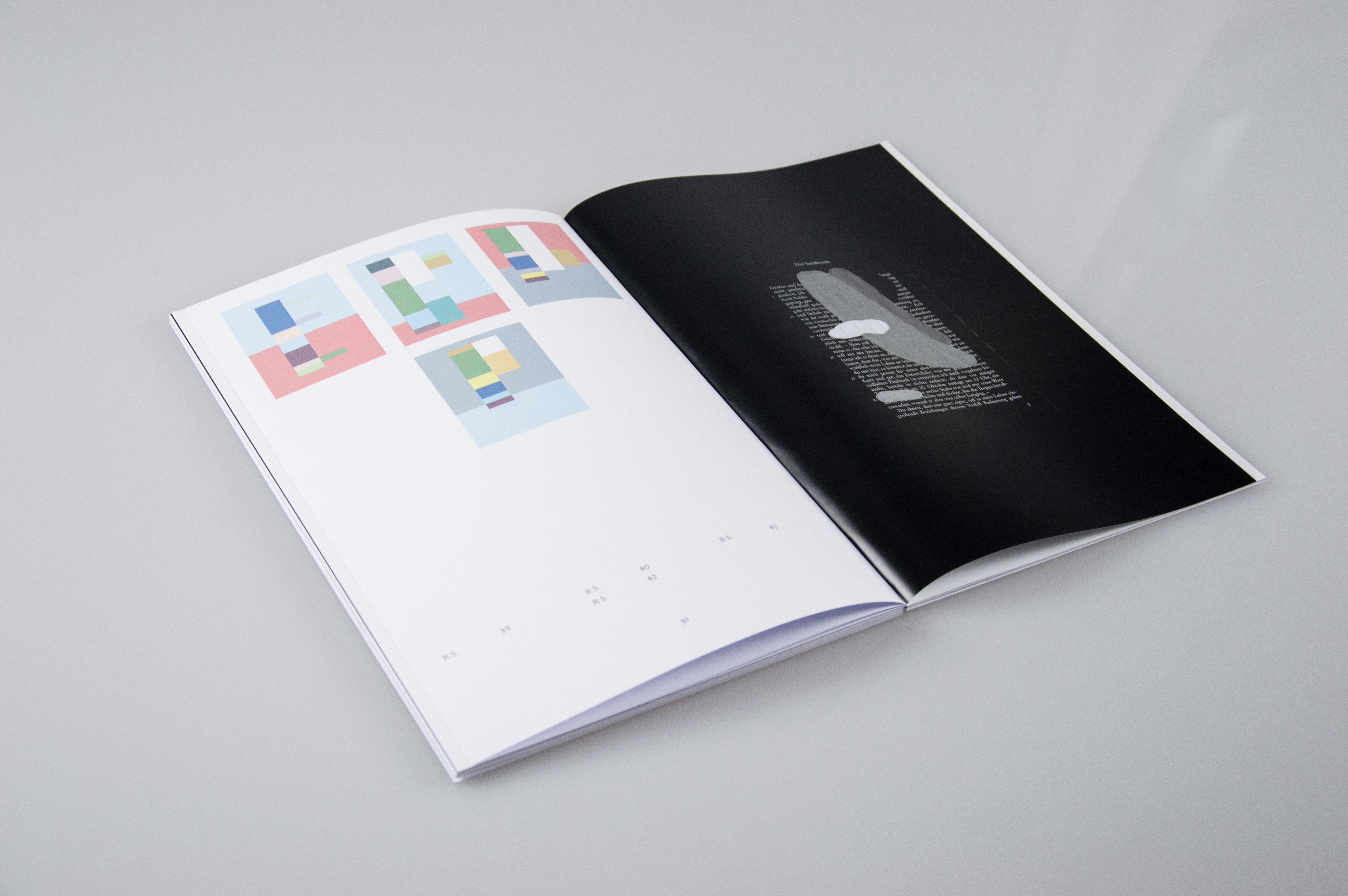

The paintings describe the emotional part of the work by their aesthetic, materiality, fantasy usage and organic design vocabular


An analytical and scientific approach contains an infographic character


The artistic approach also reflects the analogy between paintings and the structure of the text. Both ways of generating different designs with also different looks and feels can be seen as two single works but also as a whole through their inseparability in their core.
Both of them are continually based on the motives and figures, their appearance as in descriptions of their visual appearance and also formal appearance as in their mentioning on every single page. Those specifications modify the composition and grid for the visuals, their color and content. The magazine which can also be seen as a process book is not only representing and combining the methods but is also based on the chronology and structure of the story and therefore stands for the narrative and intellectual content of the book and work.
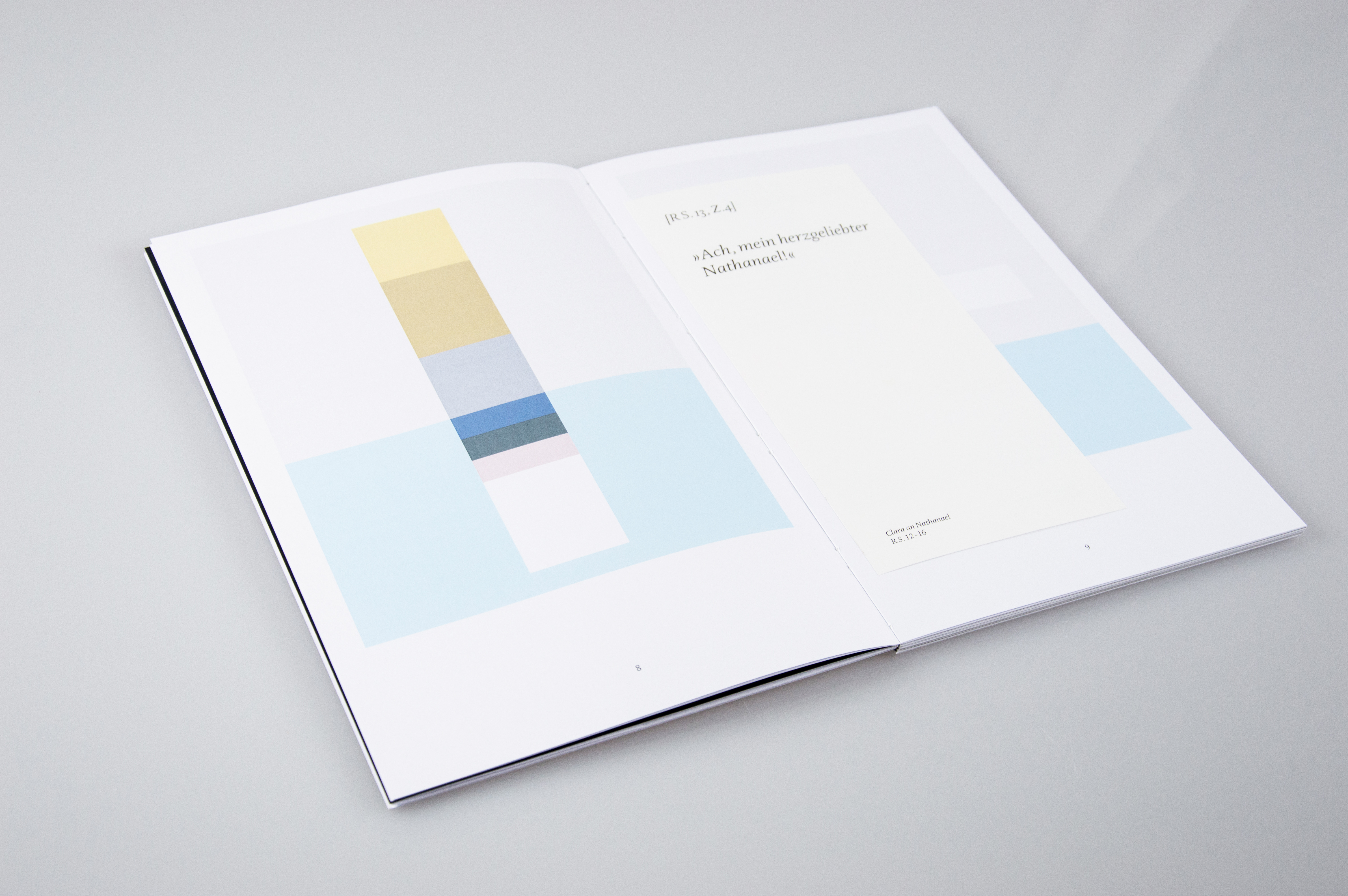
The typographical concept supports the visual language, the analytical part of the work and tells the story by quotes in outline. The layering of paper, content/text and visuals represent the multifaceted aspect of the story.
The paintings describe the emotional part of the work by their aesthetic, materiality, fantasy usage and organic design vocabulary.
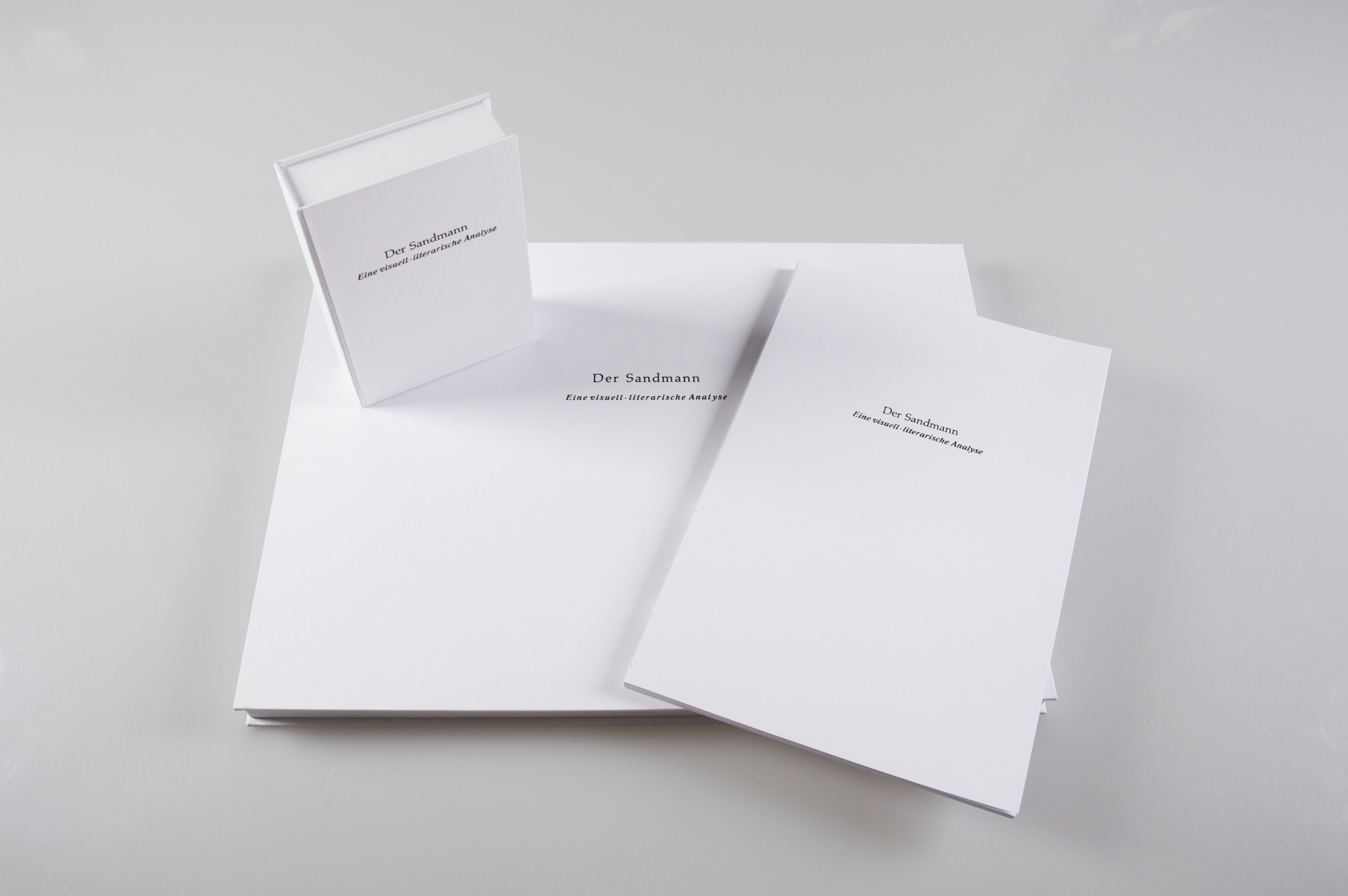
The cardboard packages wrap the different results and designs and connect the two realities into one visual unity which reflects the content dependent on both methods and their common bond.
—